Project Transitions
Non-profit web and mobile redesign
Non-profit web and mobile redesign
Background
With a passion for compassion and rehabilitation, Project Transitions is the only organization in Central Texas that provides supportive affordable housing to homeless individuals with HIV. Unique in their mission, they also provide supportive services to help facilitate the road to recovery.
The Problem
The organization relies heavily on volunteer participation and donations through their website to operate. Unfortunately, they have been receiving a low percentage rate of donations from visitors and are having a hard time finding volunteers.
The Goal
Our challenge was to explore different ways to improve the existing site to generate more donations and volunteers. How might we design a new digital voice that would help inspire visitors to volunteer or donate? Through contextual research, user interviews, and a redesign process, our goals included:
•Easier Navigation
•Restructure interface design to simple and intuitive
•Make language clear and effective
•Emphasis on the more meaningful information
•Impactful 'call-to-action' buttons
•Insight to what works/doesn't work with the current site
•Improve users' understanding and awareness
•Restructure interface design to simple and intuitive
•Make language clear and effective
•Emphasis on the more meaningful information
•Impactful 'call-to-action' buttons
•Insight to what works/doesn't work with the current site
•Improve users' understanding and awareness

Research
User Research
User Research
First we conducted personal interviews to six participants who expressed interest in volunteering and donating to organizations.
Interview Objectives:
•What factors influence them when deciding on organizations/causes to be involved with?
•What social issues they care about and why?
•Have they ever made an online donation?
•What factors influence them when deciding on organizations/causes to be involved with?
•What social issues they care about and why?
•Have they ever made an online donation?
We used affinity mapping to find common themes in our data. We were able to discover several major trends that would help guide our design decisions. Some of the key takeaways were:
•Users felt like they couldn't make a difference on an individual level
•Users are more likely to donate or volunteer for organizations that align with their values
•Users want to be more involved but aren't sure where or how to start
•Users were more likely to donate than to volunteer, with limited time being the main barrier
•Users are more likely to donate or volunteer for organizations that align with their values
•Users want to be more involved but aren't sure where or how to start
•Users were more likely to donate than to volunteer, with limited time being the main barrier
Task Analysis
We then had the six interviewees browse the current Project Transitions webpage. We wanted live feedback. We tasked them to:
1. Make a $5 online donation.
2. Provide a brief explanation of the mission and types of services offered by Project Transitions, after browsing the site for 5 minutes.
2. Provide a brief explanation of the mission and types of services offered by Project Transitions, after browsing the site for 5 minutes.
6/6 were able to complete the first task in making a donation. 4/6 were able to correctly complete the second task.
Insights:
•Overwhelmed by disorganization of content. Chaotic vibes
•Site is way too wordy, unable to take away key points
•#1 pain point is having to create an account to be able to make a donation
•The mission is unclear and all users said this would deter them
•All users preferred to use their mobile device opposed to a desktop to complete these tasks


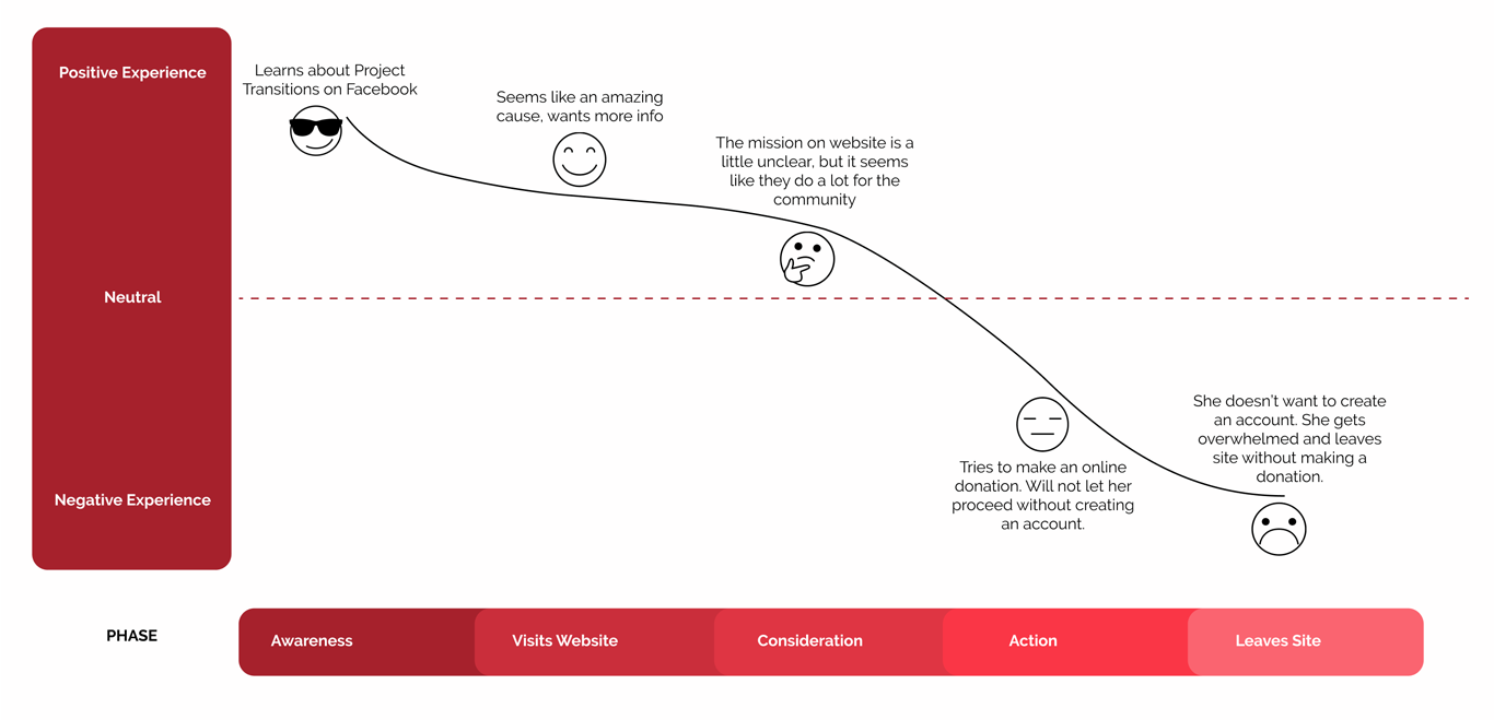
Meet Cathy
With the understanding of the needs and pain points of our target users, a persona and journey map was created to better empathize with the user and guide us through the design process.
Cathy is passionate about helping her community and giving back to others. Since her salary depends on her sales performance she works around the clock and doesn't have a lot of free time to volunteer like she wishes she could.
She Wants:
✓ To contribute money to a local non-profit that will make a positive impact on the community
She Needs:
✓ A simple and efficient way to donate with updates on where the resources are going
Pain Point:
✓ Hard to find a non-profit where she feels her money is truly going to make an impact
Current Site Analysis
We looked at the current website to determine areas of improvement to increase donors while addressing user needs.
#1
Consistently Inconsistent
Consistently Inconsistent
Scrolling through the webpage it was clear that consistency needed to be improved. There was no clear visual hierarchy and no effective utilization of white space. There was a number of different fonts, buttons, and colors being used. This made the page seem jumbled and hindered the message of their cause.
#2
Lack of Character
Lack of Character
It's unclear who the target audience is and what is being communicated to them. Connecting with users is crucial in understanding their needs and how to meet them.
#3
Overloaded Navigation Bar/Header
Overloaded Navigation Bar/Header
We live in a world where people expect to find the solution to their problems with the least amount of effort. When finding information becomes too difficult, i.e. by having to read through too many drop down menus, there's a higher risk of them abandoning it. The navigation bar should take our user on a journey of the prioritized content.
Scoping out the competition
We conducted a competitive research analysis to find any consistent themes in the non-profit world. We looked at two direct competitors- Vivent Health and San Antonio AIDS Foundation, and one indirect competitor- OutYouth.

Findings:
•Call-to-action "DONATE" buttons are placed in the headers of all 3 websites. This thoughtful placement is key in catching the visitor's eye.
•Clean, sleek, and consistent design interfaces establish a more professional feel.
•Less is more. Content isn't word heavy. Easier to understand and digest information.
•Process to complete an online donation does not require an account to be created.
•Organized nav bar makes content easier to find.
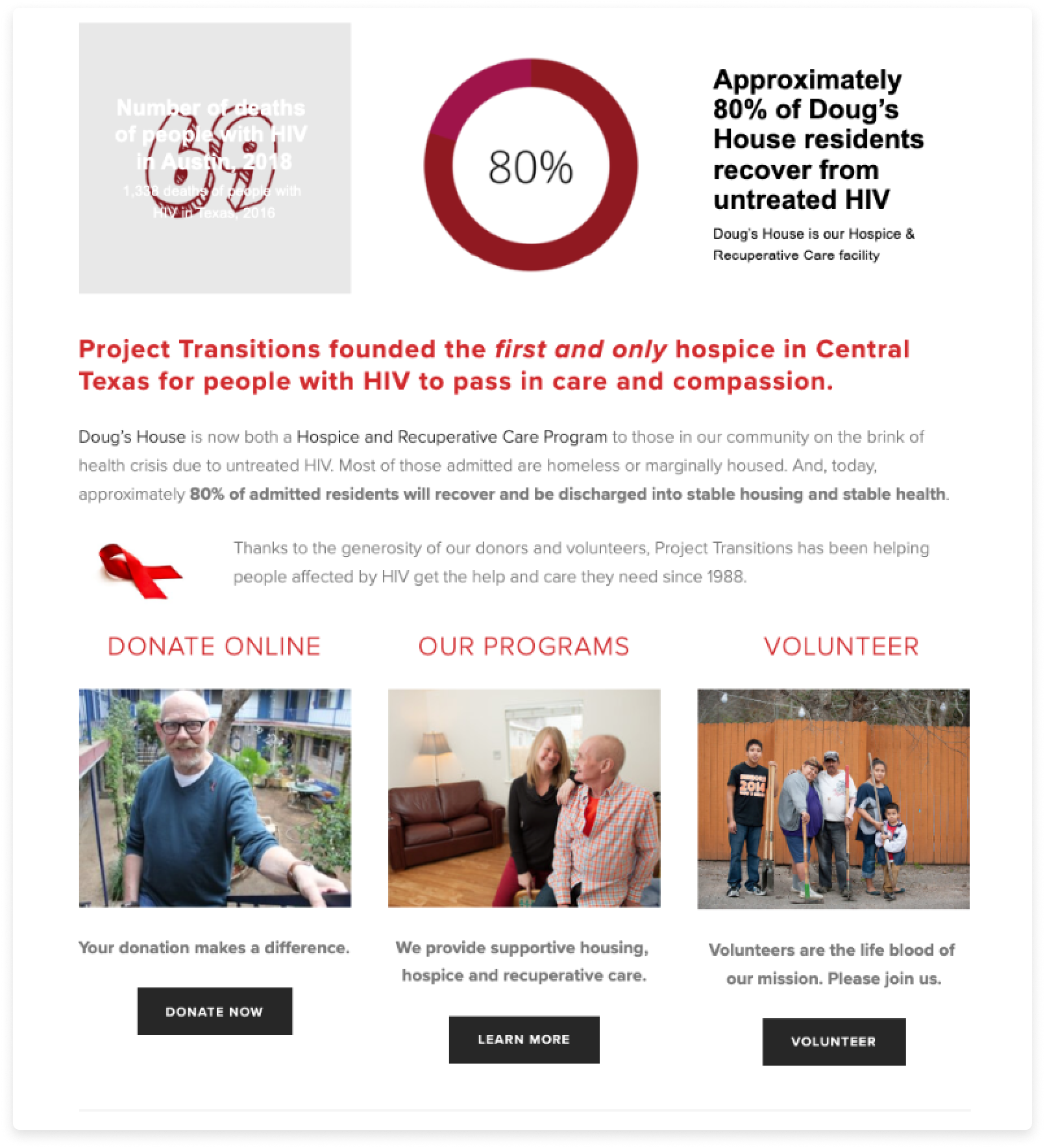
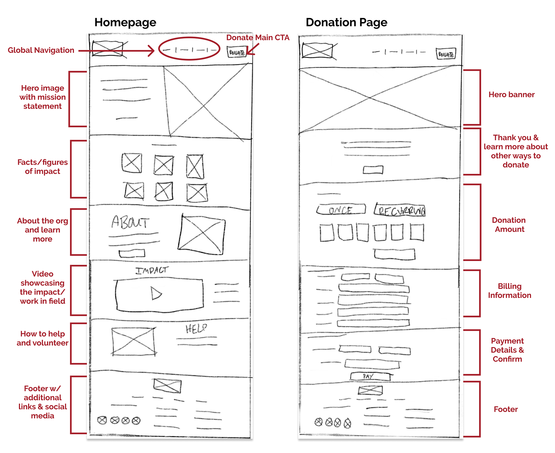
Designing a Solution
Paper Sketches
With Cathy at the forefront of our minds and a better understanding of what the problem was, we were able to start coming up with effective strategies.
We utilized a feature prioritization matrix to help us narrow down the essential features for the redesign. We felt the following were "must" haves:
•Effectively placed "DONATE" and "Become a Volunteer" call-to-action buttons.
•Clear and streamlined navigation bar.
•Established visual hierarchy with less jarring blocks of text.
•A new donation page that allows the option to "Checkout as Guest."
•Clear and streamlined navigation bar.
•Established visual hierarchy with less jarring blocks of text.
•A new donation page that allows the option to "Checkout as Guest."
UI Style Guide
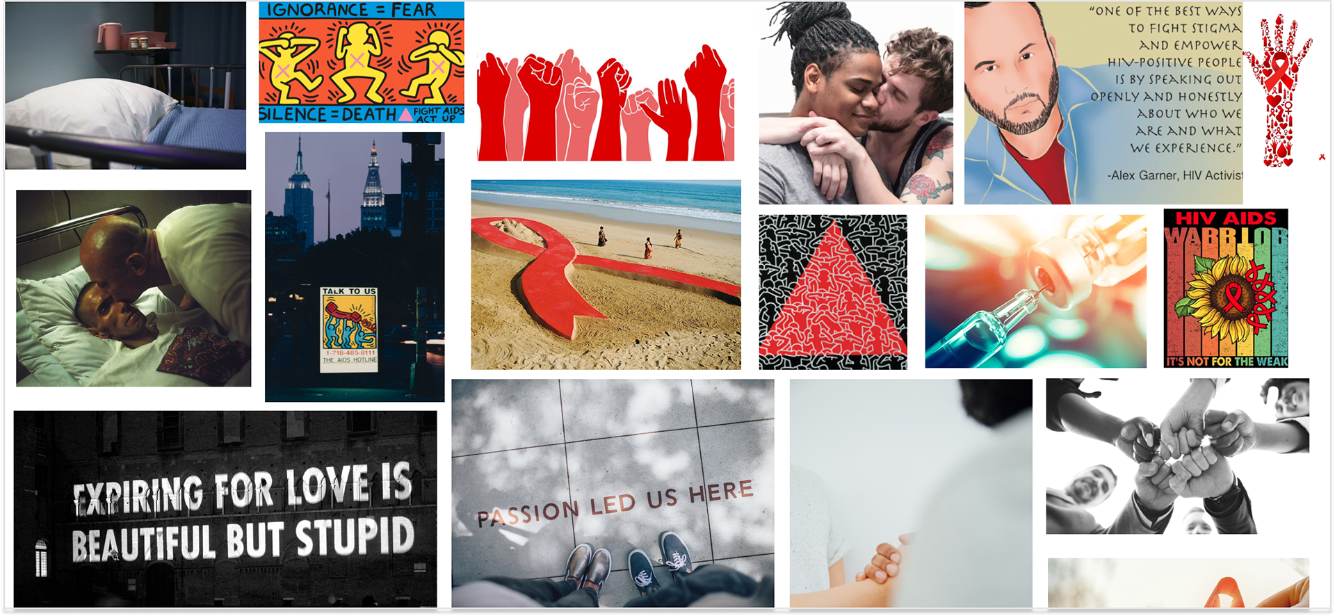
We made a collaborative moodboard using InVision which inspired our updated design system. We wanted to give the webpage a fresh rebrand with new logo iterations, an updated color palette, iconography, consistency, and powerful photography/art influences.

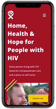
Mid-Fi to High-Fi Designs
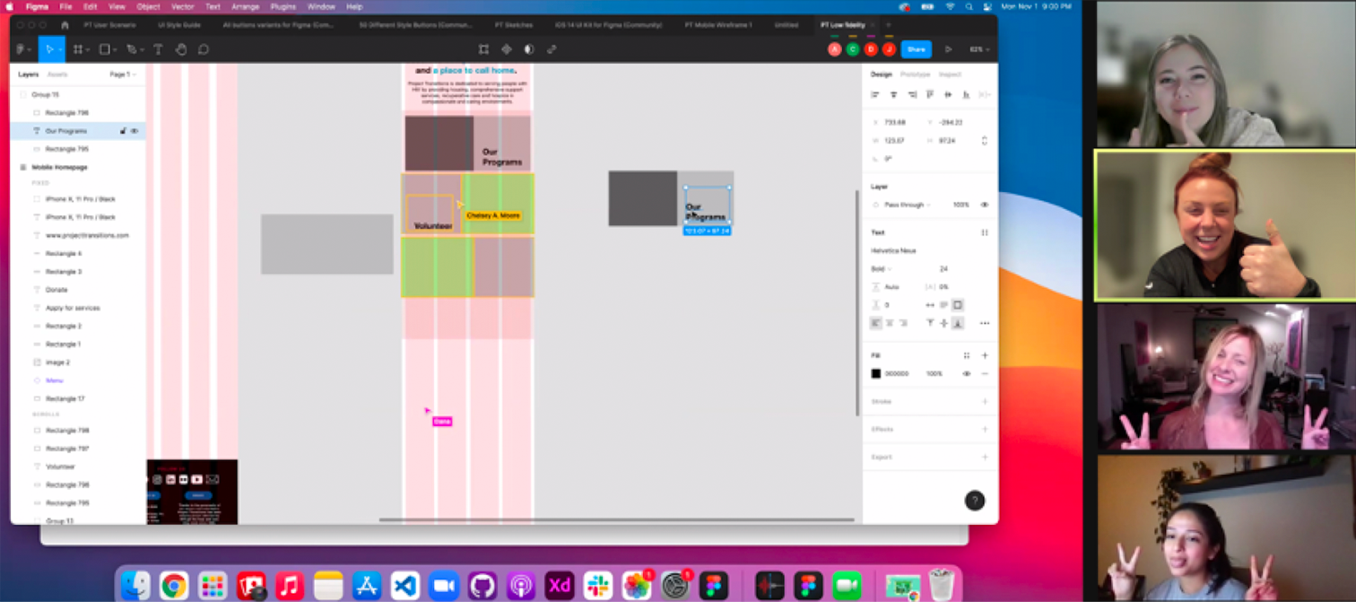
After another round of the same task-based user testing on our lo-fidelity prototype, we were able to iterate to mid and high-fi designs in Figma, driven by the feedback from our user testing. We also conducted card sorting activities to assist in building the structure, understanding users' expectations, and re-labeling the navigation bar.
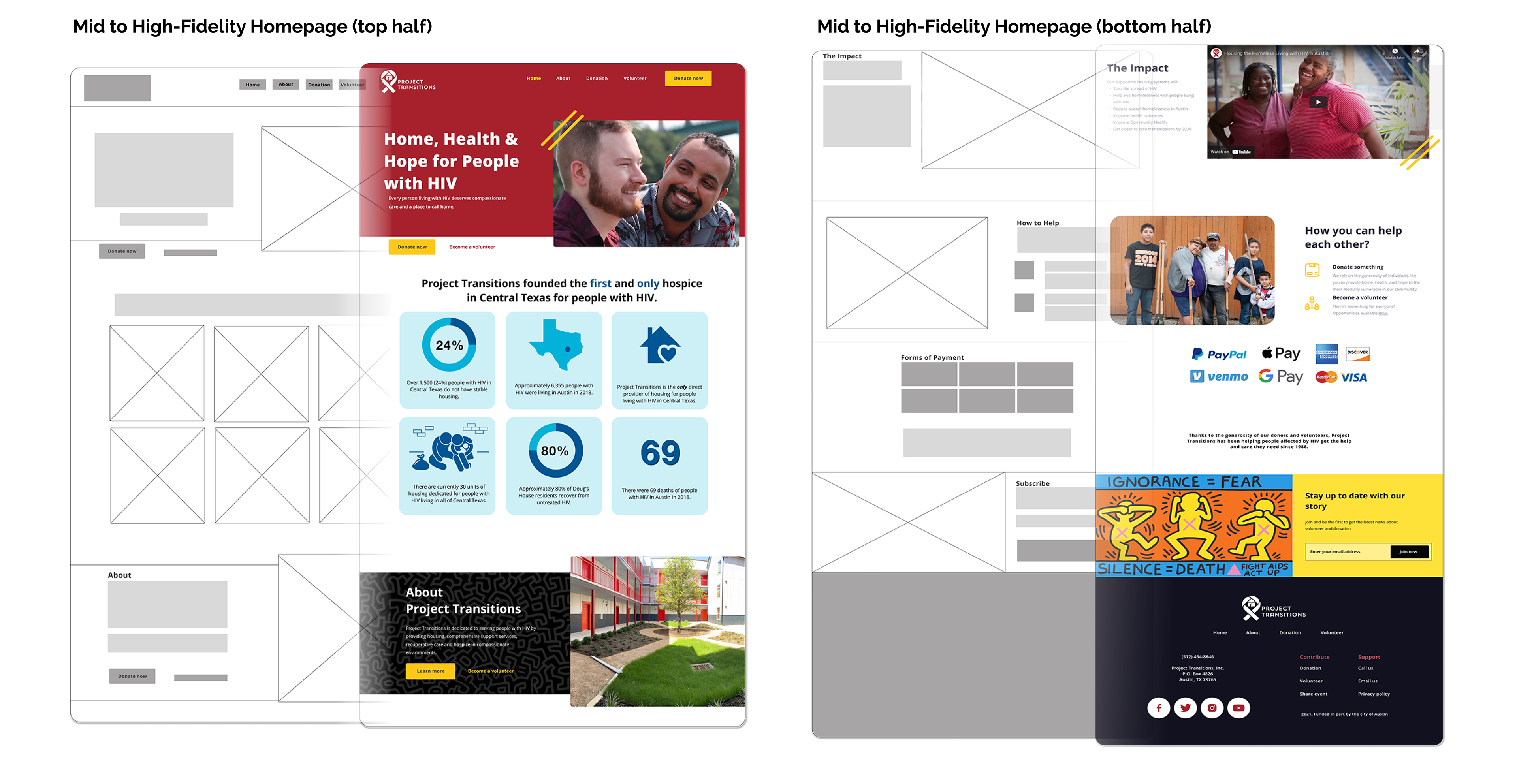
Bringing it all to life
Interaction Design Using Figma
Interaction Design Using Figma
We also focused on wireframing for a mobile prototype, including an easier checkout process for users to donate. These features were driven by research, usability testing and feedback.
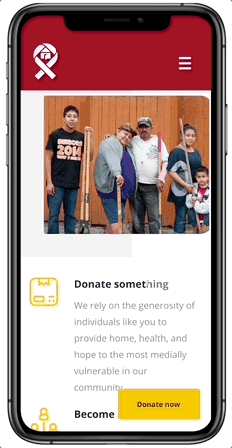
New homepage &
streamlined hamburger menu
streamlined hamburger menu
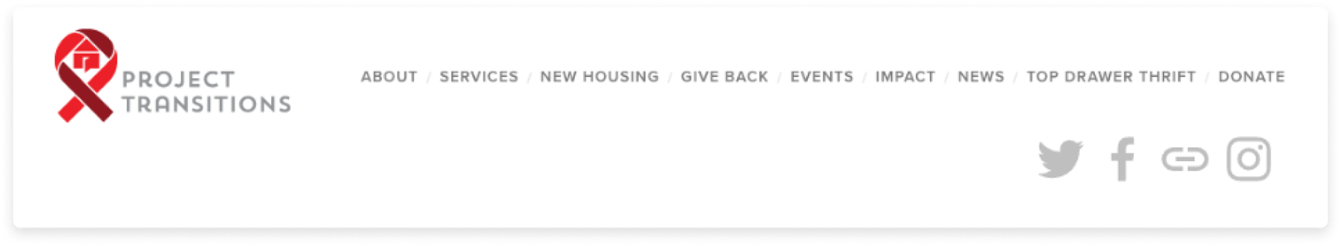
Much like the overloaded website navigation bar, the original mobile hamburger menu had 9 option choices. We streamlined the new hamburger menu to mirror the updated navigation bar.
We also included a search menu and social media links so users have quick access to the showcased topics.
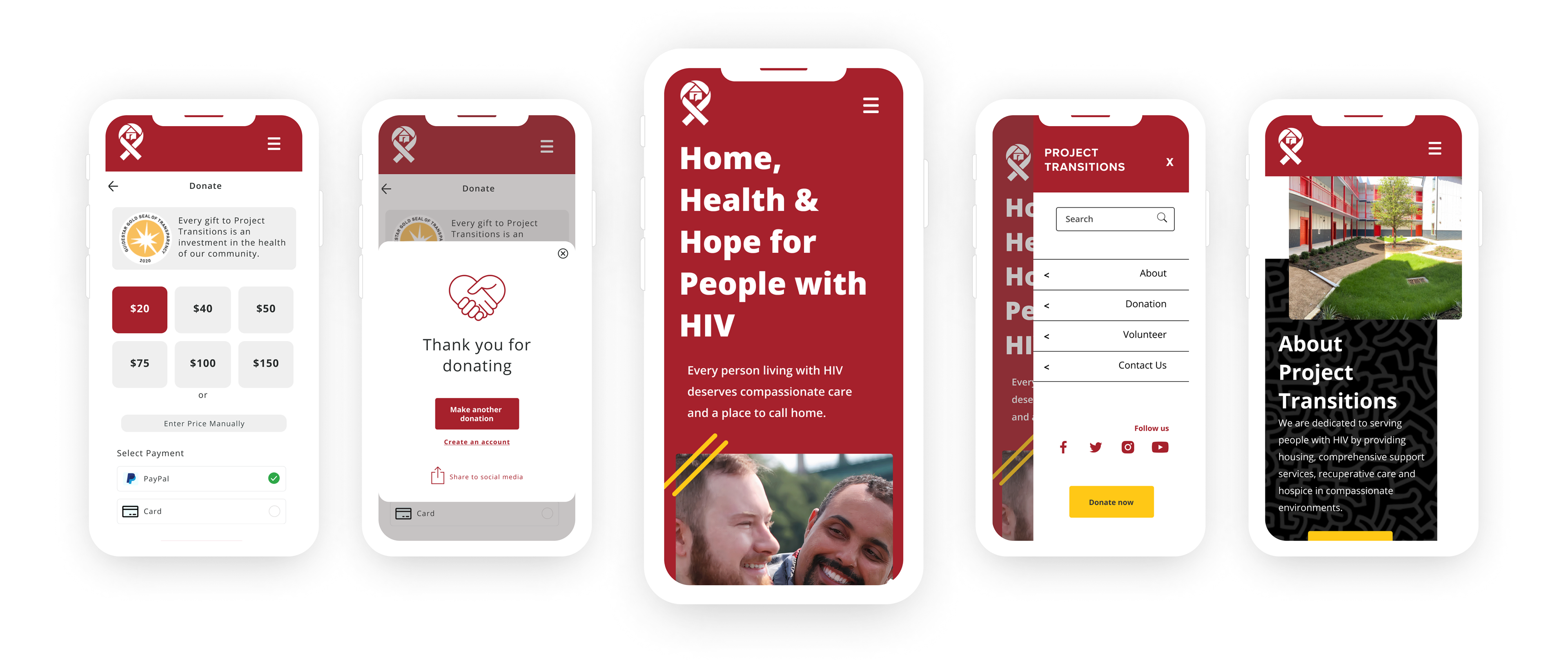
Updated checkout process for donations
The main blocker for online donations was the involved checkout process. Data from our user tests showed the main factor for cart abandonment was having to create an account to be able to make a donation.
We updated the checkout process to allow users the option to pay securely via paypal or to manually enter their card number, without having to make an account.
Final Thoughts
This project made me realize how crucial it is to design with your targeted audience in mind. It was very hard to identify who the target audience was and what was trying to be communicated to them with the original website.
Through our research we were able to gain a better clarity on- 1. who would be visiting our webpage, 2. why they're visiting, and 3. how we can better connect with them to reach the end goal of more donations and volunteers.
It felt really nice to give back and be able to help out the cause for this nonprofit.